|
This memorable artwork (by George Underwood) is usually known as the UK sleeve. At Redhill Matthew Fisher commented that he much preferred the British Shine on Brightly sleeve-design, which so carefully illustrates the extravagant imagery of the title song, to the American version, which just strikes him as 'a photograph someone had hanging around'. |
|
The tedious, ersatz 'US' version was apparently commissioned by A&M to be more acceptable to US taste than the original artwork, from which it copies many motifs. Yan Friis, however, advises us that this was also the European version. 'In Norway that was the one we bought at the time, the cover being imported from Germany. In fact the first time I actually saw the British version was in 1972 when it became available as a double-album with Home.' |
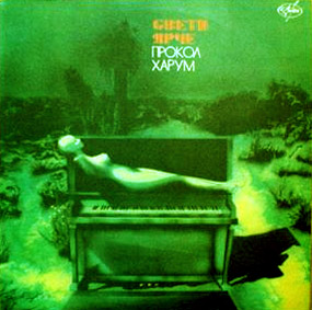 |
The Russian version
(thanks, Enrico) appears to be an outtake from the session that provided the 'US' cover |